A lot of people seem to think that distributed tracing isn't useful, or at least not without extreme effort that isn't worth it for companies smaller than FB. For example, here are a couple of public conversations that sound like a number of private conversations I've had. Sure, there's value somewhere, but it costs too much to unlock.
I think this overestimates how much work it is to get a lot of value from tracing. At Twitter, Rebecca Isaacs was able to lay out a vision for how to get value from tracing and executed on it (with help from a number other folks, including Jonathan Simms, Yuri Vishnevsky, Ruben Oanta, Dave Rusek, Hamdi Allam, and many others) such that the work easily paid for itself. This post is going to describe the tracing "infrastructure" we've built and describe some use cases where we've found it to be valuable. Before we get to that, let's start with some background about the situation before Rebecca's vision came to fruition.
At a high level, we could say that we had a trace-view oriented system and ran into all of the issues that one might expect from that. Those issues are discussed in more detail in this article by Cindy Sridharan. However, I'd like to discuss the particular issues we had in more detail since I think it's useful to look at what specific things were causing problems.
Taken together, the issues were problematic enough that tracing was underowned and arguably unowned for years. Some individuals did work in their spare time to keep the lights on or improve things, but the lack of obvious value from tracing led to a vicious cycle where the high barrier to getting value out of tracing made it hard to fund organizationally, which made it hard to make tracing more usable.
Some of the issues that made tracing low ROI included:
- Schema made it impossible to run simple queries "in place"
- No real way to aggregate info
- No way to find interesting or representative traces
- Impossible to know actual sampling rate, sampling highly non-representative
- Time
Schema
The schema was effectively a set of traces, where each trace was a set of spans and each span was a set of annotations. Each span that wasn't a root span had a pointer to its parent, so that the graph structure of a trace could be determined.
For the purposes of this post, we can think of each trace as either an external request including all sub-RPCs or a subset of a request, rooted downstream instead of at the top of the request. We also trace some things that aren't requests, like builds and git operations, but for simplicity we're going to ignore those for this post even though the techniques we'll discuss also apply to those.
Each span corresponds to an RPC and each annotation is data that a developer chose to record on a span (e.g., the size of the RPC payload, queue depth of various queues in the system at the time of the span, or GC pause time for GC pauses that interrupted the RPC).
Some issues that came out of having a schema that was a set of sets (of bags) included:
- Executing any query that used information about the graph structure inherent in a trace required reading every span in the trace and reconstructing the graph
- Because there was no index or summary information of per-trace information, any query on a trace required reading every span in a trace
- Practically speaking, because the two items above are too expensive to do at query time in an ad hoc fashion, the only query people ran was some variant of "give me a few spans matching a simple filter"
Aggregation
Until about a year and a half ago, the only supported way to look at traces was to go to the UI, filter by a service name from a combination search box + dropdown, and then look at a list of recent traces, where you could click on any trace to get a "trace view". Each search returned the N most recent results, which wouldn't necessarily be representative of all recent results (for reasons mentioned below in the Sampling section), let alone representative of all results over any other time span.
Per the problems discussed above in the schema section, since it was too expensive to run queries across a non-trivial number of traces, it was impossible to ask questions like "are any of the traces I'm looking at representative of common traces or am I looking at weird edge cases?" or "show me traces of specific tail events, e.g., when a request from service A to service B times out or when write amplification from service A to some backing database is > 3x", or even "only show me complete traces, i.e., traces where we haven't dropped spans from the trace".
Also, if you clicked on a trace that was "too large", the query would time out and you wouldn't be able to view the trace -- this was another common side effect of the lack of any kind of rate limiting logic plus the schema.
Sampling
There were multiple places where a decision was made to sample or not. There was no document that listed all of these places, making it impossible to even guess at the sampling rate without auditing all code to figure out where sampling decisions were being made.
Moreover, there were multiple places where an unintentional sampling decision would be made due to the implementation. Spans were sent from services that had tracing enabled to a local agent, then to a "collector" service, and then from the collector service to our backing DB. Spans could be dropped at of these points: in the local agent; in the collector, which would have nodes fall over and lose all of their data regularly; and at the backing DB, which would reject writes due to hot keys or high load in general.
This design where the trace id is the database key, with no intervening logic to pace out writes, meant that a 1M span trace (which we have) would cause 1M writes to the same key over a period of a few seconds. Another problem would be requests with a fanout of thousands (which exists at every tech company I've worked for), which could cause thousands writes with the same key over a period of a few milliseconds.
Another sampling quirk was that, in order to avoid missing traces that didn't start at our internal front end, there was logic that caused an independent sampling decision in every RPC. If you do the math on this, if you have a service-oriented architecture like ours and you sample at what naively might sound like a moderately low rate, like, you'll end up with the vast majority of your spans starting at a leaf RPC, resulting in a single span trace. Of the non-leaf RPCs, the vast majority will start at the 2nd level from the leaf, and so on. The vast majority of our load and our storage costs were from these virtually useless traces that started at or near a leaf, and if you wanted to do any kind of analysis across spans to understand the behavior of the entire system, you'd have to account for this sampling bias on top of accounting for all of the other independent sampling decisions.
Time
There wasn't really any kind of adjustment for clock skew (there was something, but it attempted to do a local pairwise adjustment, which didn't really improve things and actually made it more difficult to reasonably account for clock skew).
If you just naively computed how long a span took, even using timestamps from a single host, which removes many sources of possible clock skew, you'd get a lot of negative duration spans, which is of course impossible because a result can't get returned before the request for the result is created. And if you compared times across different hosts, the results were even worse.
Solutions
The solutions to these problems fall into what I think of as two buckets. For problems like dropped spans due to collector nodes falling over or the backing DB dropping requests, there's some straightforward engineering solution using well understood and widely used techniques. For that particular pair of problems, the short term bandaid was to do some GC tuning that reduced the rate of collector nodes falling over by about a factor of 100. That took all of two minutes, and then we replaced the collector nodes with a real queue that could absorb larger bursts in traffic and pace out writes to the DB. For the issue where we oversampled leaf-level spans due to rolling the sampling dice on every RPC, that's one of these little questions that most people would get right in an interview that can sometimes get lost as part of a larger system that has a number of solutions, e.g., since each span has a parent pointer, we must be able to know if an RPC has a parent or not in a relevant place and we can make a sampling decision and create a traceid iff a span has no parent pointer, which results in a uniform probability of each span being sampled, with each sampled trace being a complete trace.
The other bucket is building up datasets and tools (and adding annotations) that allow users to answer questions they might have. This isn't a new idea, section 5 of the Dapper paper discussed this and it was published in 2010.
Of course, one major difference is that Google has probably put at least two orders of magnitude more effort into building tools on top of Dapper than we've put into building tools on top of our tracing infra, so a lot of our tooling is much rougher, e.g., figure 6 from the Dapper paper shows a trace view that displays a set of relevant histograms, which makes it easy to understand the context of a trace. We haven't done the UI work for that yet, so the analogous view requires running a simple SQL query. While that's not hard, presenting the user with the data would be a better user experience than making the user query for the data.
Of the work that's been done, the simplest obviously high ROI thing we've done is build a set of tables that contain information people might want to query, structured such that common queries that don't inherently have to do a lot of work don't have to do a lot of work.
We have, partitioned by day, the following tables:
- trace_index
- high-level trace-level information, e.g., does the trace have a root; what is the root; if relevant, what request endpoint was hit, etc.
- span_index
- information on the client and server
- anno_index
- "standard" annotations that people often want to query, e.g., request and response payload sizes, client/server send/recv timestamps, etc.
- span_metrics
- computed metrics, e.g., span durations
- flat_annotation
- All annotations, in case you want to query something not in anno_index
- trace_graph
- For each trace, contains a graph representation of the trace, for use with queries that need the graph structure
Just having this set of tables, queryable with SQL queries (or a Scalding or Spark job in cases where Presto SQL isn't ideal, like when doing some graph queries) is enough for tracing to pay for itself, to go from being difficult to justify to being something that's obviously high value.
Some of the questions we've been to answer with this set of tables includes:
- For this service that's having problems, give me a representative set of traces
- For this service that has elevated load, show me which upstream service is causing the load
- Give me the list of all services that have unusual write amplification to downstream service X
- Is traffic from a particular service or for a particular endpoint causing unusual write amplification? For example, in some cases, we see nothing unusual about the total write amplification from B -> C, but we see very high amplification from B -> C when B is called by A.
- Show me how much time we spend on serdes vs. "actual work" for various requests
- Show me how much different kinds of requests cost in terms of backend work
- For requests that have high latency, as determined by mobile client instrumentation, show me what happened on the backend
- Show me the set of latency critical paths for this request endpoint (with the annotations we currently have, this has a number issues that probably deserve their own post)
- Show me the CDF of services that this service depends on
- This is a distribution because whether or not a particular service calls another service is data dependent; it's not uncommon to have a service that will only call another one every 1000 calls (on average)
We have built and are building other tooling, but just being able to run queries and aggregations against trace data, both recent and historical, easily pays for all of the other work we'd like to do. This analogous to what we saw when we looked at metrics data, taking data we already had and exposing it in a way that lets people run arbitrary queries immediately paid dividends. Doing that for tracing is less straightforward than doing that for metrics because the data is richer, but it's a not fundamentally different idea.
I think that having something to look at other than the raw data is also more important for tracing than it is for metrics since the metrics equivalent of a raw "trace view" of traces, a "dashboard view" of metrics where you just look at graphs, is obviously and intuitively useful. If that's all you have for metrics, people aren't going to say that it's not worth funding your metrics infra because dashboards are really useful! However, it's a lot harder to see how to get value out of a raw view of traces, which is where a lot of the comments about tracing not being valuable come from. This difference between the complexity of metrics data and tracing data makes the value add for higher-level views of tracing larger than it is for metrics.
Having our data in a format that's not just blobs in a NoSQL DB has also allowed us to more easily build tooling on top of trace data that lets users who don't want to run SQL queries get value out of our trace data. An example of this is the Service Dependency Explorer (SDE), which was primarily built by Yuri Vishnevsky, Rebecca Isaacs, and Jonathan Simms, with help from Yihong Chen. If we try to look at the RPC call graph for a single request, we get something that's pretty large. In some cases, the depth of the call tree can be hundreds of levels deep and it's also not uncommon to see a fanout of 20 or more at some levels, which makes a naive visualization difficult to interpret.
In order to see how SDE works, let's look at a smaller example where it's relatively easy to understand what's going on. Imagine we have 8 services, A through H and they call each other as shown in the tree below, we we have service A called 10 times, which calls service B a total of 10 times, which calls D, D, and E 50, 20, and 10 times respectively, where the two Ds are distinguished by being different RPC endpoints (calls) even though they're the same service, and so on, shown below:
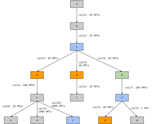
If we look at SDE from the standpoint of node E, we'll see the following: 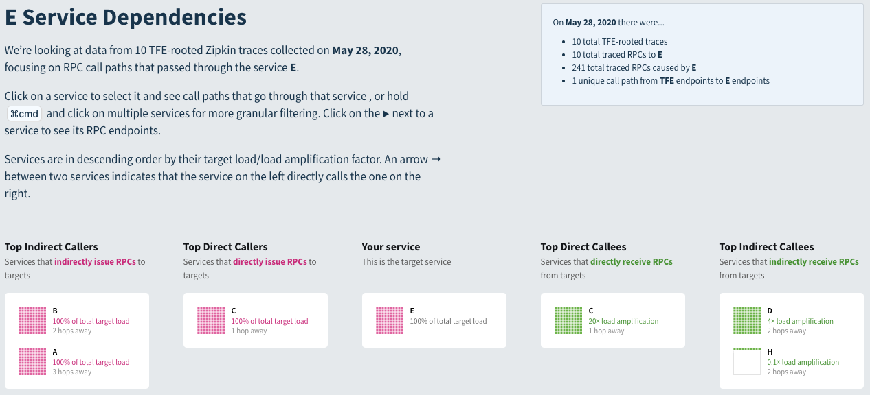
We can see the direct callers and callees, 100% of calls of E are from C, and 100% of calls of E also call C and that we have 20x load amplification when calling C (200/10 = 20), the same as we see if we look at the RPC tree above. If we look at indirect callees, we can see that D has a 4x load amplification (40 / 10 = 4).
If we want to see what's directly called by C downstream of E, we can select it and we'll get arrows to the direct descendants of C, which in this case is every indirect callee of E.
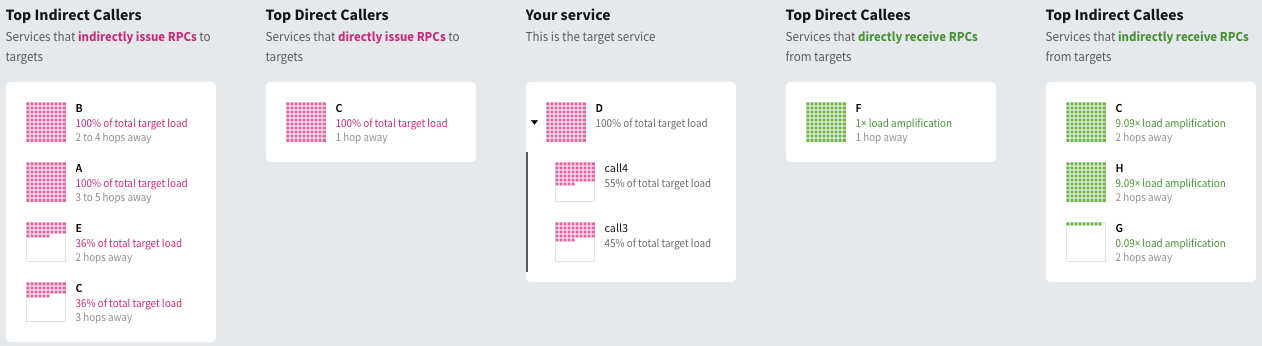
For a more complicated example, we can look at service D, which shows up in orange in our original tree, above.
In this case, our summary box reads:
- On May 28, 2020 there were...
- 10 total TFE-rooted traces
- 110 total traced RPCs to D
- 2.1 thousand total traced RPCs caused by D
- 3 unique call paths from TFE endpoints to D endpoints
The fact that we see D three times in the tree is indicated in the summary box, where it says we have 3 unique call paths from our front end, TFE to D.
We can expand out the calls to D and, in this case, see both of the calls and what fraction of traffic is to each call.
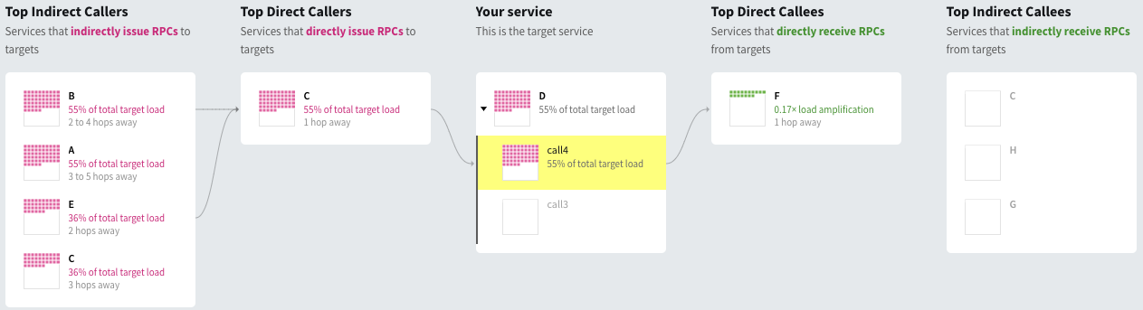
If we click on one of the calls, we can see which nodes are upstream and downstream dependencies of a particular call, call4 is shown below and we can see that it never hits services C, H, and G downstream even though service D does for call3. Similarly, we can see that its upstream dependencies consist of being called directly by C, and indirectly by B and E but not A and C:
Some things we can easily see from SDE are:
- What load a service or RPC call causes
- Where we have unusual load amplification, whether that's generally true for a service or if it only occurs on some call paths
- What causes load to a service or RPC call
- Where and why we get cycles (very common for Strato, among other things
- What's causing weird super deep traces
These are all things a user could get out of queries to the data we store, but having a tool with a UI that lets you click around in real time to explore things lowers the barrier to finding these things out.
In the example shown above, there are a small number of services, so you could get similar information out of the more commonly used sea of nodes view, where each node is a service, with some annotations on the visualization, but when we've looked at real traces, showing thousands of services and a global makes it very difficult to see what's going on. Some of Rebecca's early analyses used a view like that, but we've found that you need to have a lot of implicit knowledge to make good use of a view like that, a view that discards a lot more information and highlights a few things makes it easier to users who don't happen to have the right implicit knowledge to get value out of looking at traces.
Although we've demo'd a view of RPC count / load here, we could also display other things, like latency, errors, payload sizes, etc.
Conclusion
More generally, this is just a brief description of a few of the things we've built on top of the data you get if you have basic distributed tracing set up. You probably don't want to do exactly what we've done since you probably have somewhat different problems and you're very unlikely to encounter the exact set of problems that our tracing infra had. From backchannel chatter with folks at other companies, I don't think the level of problems we had was unique; if anything, our tracing infra was in a better state than at many or most peer companies (which excludes behemoths like FB/Google/Amazon) since it basically worked and people could and did use the trace view we had to debug real production issues. But, as they say, unhappy systems are unhappy in their own way.
Like our previous look at metrics analytics, this work was done incrementally. Since trace data is much richer than metrics data, a lot more time was spent doing ad hoc analyses of the data before writing the Scalding (MapReduce) jobs that produce the tables mentioned in this post, but the individual analyses were valuable enough that there wasn't really a time when this set of projects didn't pay for itself after the first few weeks it took to clean up some of the worst data quality issues and run an (extremely painful) ad hoc analysis with the existing infra.
Looking back at discussions on whether or not it makes sense to work on tracing infra, people often point to the numerous failures at various companies to justify a buy (instead of build) decision. I don't think that's exactly unreasonable, the base rate of failure of similar projects shouldn't be ignored. But, on the other hand, most of the work described wasn't super tricky, beyond getting organizational buy-in and having a clear picture of the value that tracing can bring.
One thing that's a bit beyond the scope of this post that probably deserves its own post is that, tracing and metrics, while not fully orthogonal, are complementary and having only one or the other leaves you blind to a lot of problems. You're going to pay a high cost for that in a variety of ways: unnecessary incidents, extra time spent debugging incidents, generally higher monetary costs due to running infra inefficiently, etc. Also, while metrics and tracing individually gives you much better visibility than having either alone, some problemls require looking at both together; some of the most interesting analyses I've done involve joining (often with a literal SQL join) trace data and metrics data.
To make it concrete, an example of something that's easy to see with tracing but annoying to see with logging unless you add logging to try to find this in particular (which you can do for any individual case, but probably don't want to do for the thousands of things tracing makes visible), is something we looked at above: "show me cases where a specific call path from the load balancer to A causes high load amplification on some service B, which may be multiple hops away from A in the call graph. In some cases, this will be apparent because A generally causes high load amplificaiton on B, but if it only happens in some cases, that's still easy to handle with tracing but it's very annoying if you're just looking at metrics.
An example of something where you want to join tracing and metrics data is when looking at the performance impact of something like a bad host on latency. You will, in general, not be able to annotate the appropriate spans that pass through the host as bad because, if you knew the host was bad at the time of the span, the host wouldn't be in production. But you can sometimes find, with historical data, a set of hosts that are bad, and then look up latency critical paths that pass through the host to determine the end-to-end impact of the bad host.
Everyone has their own biases, with respect to tracing, mine come from generally working on things that try to direct improve cost, reliability, and latency, so the examples are focused on that, but there are also a lot of other uses for tracing. You can check out Distributed Tracing in Practice or Mastering Distributed Tracing for some other perspectives.
Acknowledgements
Thanks to Rebecca Isaacs, Leah Hanson, Yao Yue, and Yuri Vishnevsky for comments/corrections/discussion.