If you read any personal finance forums late last year, there's a decent chance you ran across a question from someone who was desperately trying to lose money before the end of the year. There are a number of ways someone could do this; one commonly suggested scheme was to buy put options that were expected to expire worthless, allowing the buyer to (probably) take a loss.
One reason people were looking for ways to lose money was that, in the U.S., there's a hard income cutoff for a health insurance subsidy at $48,560 for individuals (higher for larger households; $100,400 for a family of four). There are a number of factors that can cause the details to vary (age, location, household size, type of plan), but across all circumstances, it wouldn't have been uncommon for an individual going from one side of the cut-off to the other to have their health insurance cost increase by roughly $7200/yr. That means if an individual buying ACA insurance was going to earn $55k, they'd be better off reducing their income by $6440 and getting under the $48,560 subsidy ceiling than they are earning $55k.
Although that's an unusually severe example, U.S. tax policy is full of discontinuities that disincentivize increasing earnings and, in some cases, actually incentivize decreasing earnings. Some other discontinuities are the TANF income limit, the Medicaid income limit, the CHIP income limit for free coverage, and the CHIP income limit for reduced-cost coverage. These vary by location and circumstance; the TANF and Medicaid income limits fall into ranges generally considered to be "low income" and the CHIP limits fall into ranges generally considered to be "middle class". These subsidy discontinuities have the same impact as the ACA subsidy discontinuity -- at certain income levels, people are incentivized to lose money.
Anyone may arrange his affairs so that his taxes shall be as low as possible; he is not bound to choose that pattern which best pays the treasury. There is not even a patriotic duty to increase one's taxes. Over and over again the Courts have said that there is nothing sinister in so arranging affairs as to keep taxes as low as possible. Everyone does it, rich and poor alike and all do right, for nobody owes any public duty to pay more than the law demands.
If you agree with the famous Learned Hand quote then losing money in order to reduce effective tax rate, increasing disposable income, is completely legitimate behavior at the individual level. However, a tax system that encourages people to lose money, perhaps by funneling it to (on average) much wealthier options traders by buying put options, seems sub-optimal.
A simple fix for the problems mentioned above would be to have slow phase-outs instead of sharp thresholds. Slow phase-outs are actually done for some subsidies and, while that can also have problems, they are typically less problematic than introducing a sharp discontinuity in tax/subsidy policy.
In this post, we'll look at a variety of discontinuities.
Hardware or software queues
A naive queue has discontinuous behavior. If the queue is full, new entries are dropped. If the queue isn't full, new entries are not dropped. Depending on your goals, this can often have impacts that are non-ideal. For example, in networking, a naive queue might be considered "unfair" to bursty workloads that have low overall bandwidth utilization because workloads that have low bandwidth utilization "shouldn't" suffer more drops than workloads that are less bursty but use more bandwidth (this is also arguably not unfair, depending on what your goals are).
A class of solutions to this problem are random early drop and its variants, which gives incoming items a probability of being dropped which can be determined by queue fullness (and possibly other factors), smoothing out the discontinuity and mitigating issues caused by having a discontinuous probability of queue drops.
This post on voting in link aggregators is fundamentally the same idea although, in some sense, the polarity is reversed. There's a very sharp discontinuity in how much traffic something gets based on whether or not it's on the front page. You could view this as a link getting dropped from a queue if it only receives N-1 votes and not getting dropped if it receives N votes.
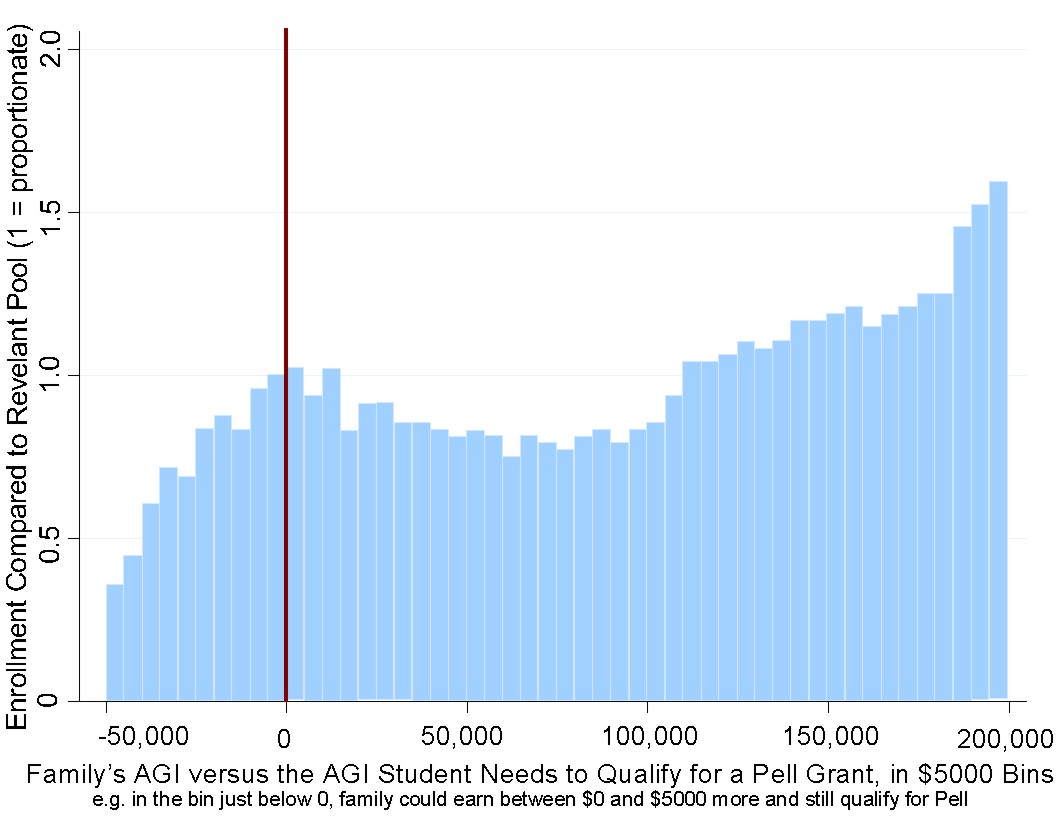
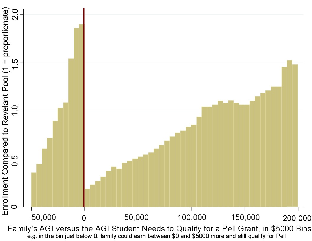
Pell Grants started getting used as a proxy for how serious schools are about helping/admitting low-income students. The first order impact is that students above the Pell Grant threshold had a significantly reduced probability of being admitted while students below the Pell Grant threshold had a significantly higher chance of being admitted. Phrased that way, it sounds like things are working as intended.
However, when we look at what happens within each group, we see outcomes that are the opposite of what we'd want if the goal is to benefit students from low income families. Among people who don't qualify for a Pell Grant, it's those with the lowest income who are the most severely impacted and have the most severely reduced probability of admission. Among people who do qualify, it's those with the highest income who are mostly likely to benefit, again the opposite of what you'd probably want if your goal is to benefit students from low income families.
We can see these in the graphs below, which are histograms of parental income among students at two universities in 2008 (first graph) and 2016 (second graph), where the red line indicates the Pell Grant threshold.
A second order effect of universities optimizing for Pell Grant recipients is that savvy parents can do the same thing that some people do to cut their taxable income at the last minute. Someone might put money into a traditional IRA instead of a Roth IRA and, if they're at their IRA contribution limit, they can try to lose money on options, effectively transferring money to options traders who are likely to be wealthier than them, in order to bring their income below the Pell Grant threshold, increasing the probability that their children will be admitted to a selective school.
The following histograms of Russian elections across polling stations shows curious spikes in turnout and results at nice, round, numbers (e.g., 95%) starting around 2004. This appears to indicate that there's election fraud via fabricated results and that at least some of the people fabricating results don't bother with fabricating results that have a smooth distribution.
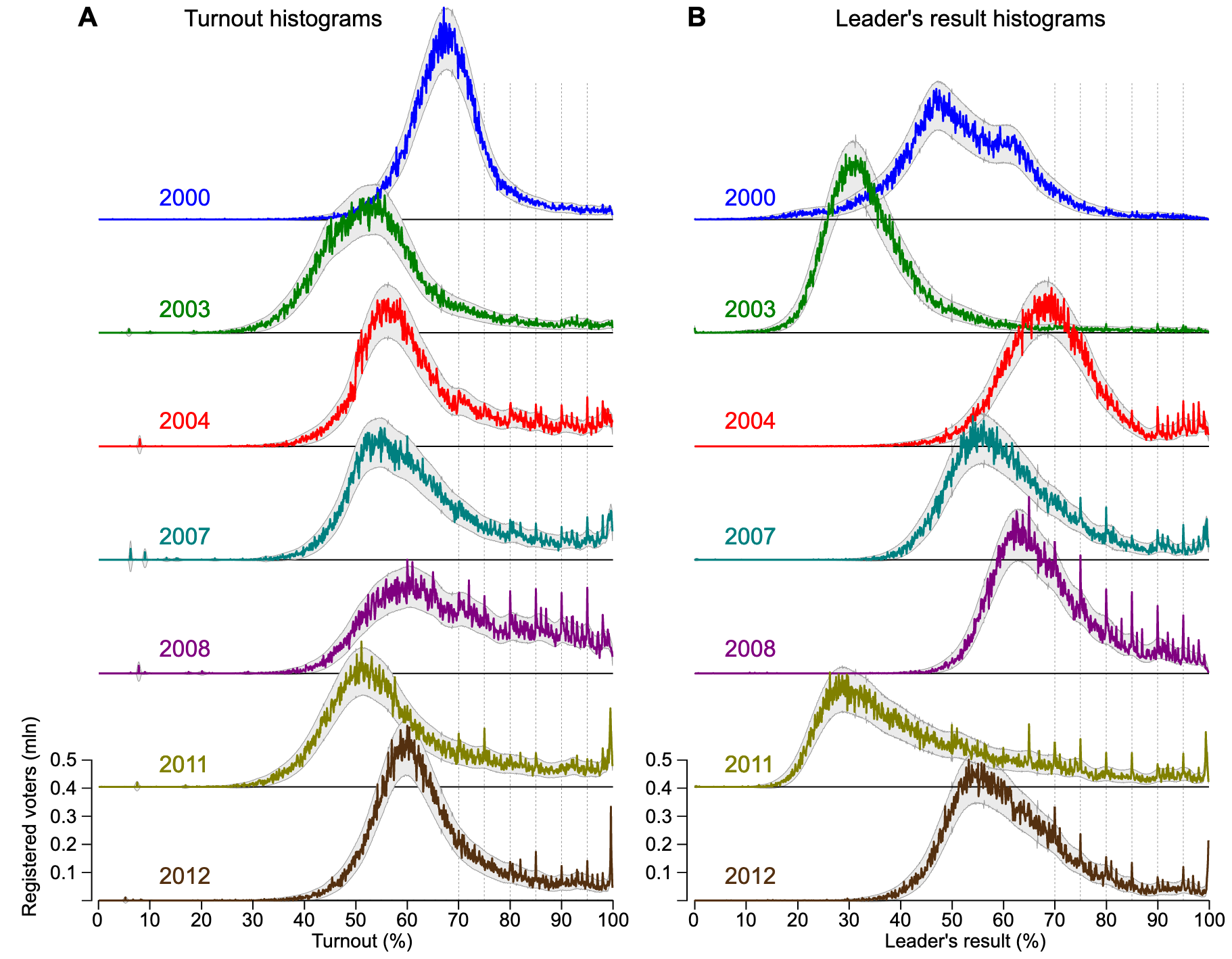
For finding fraudulent numbers, also see, Benford's law.
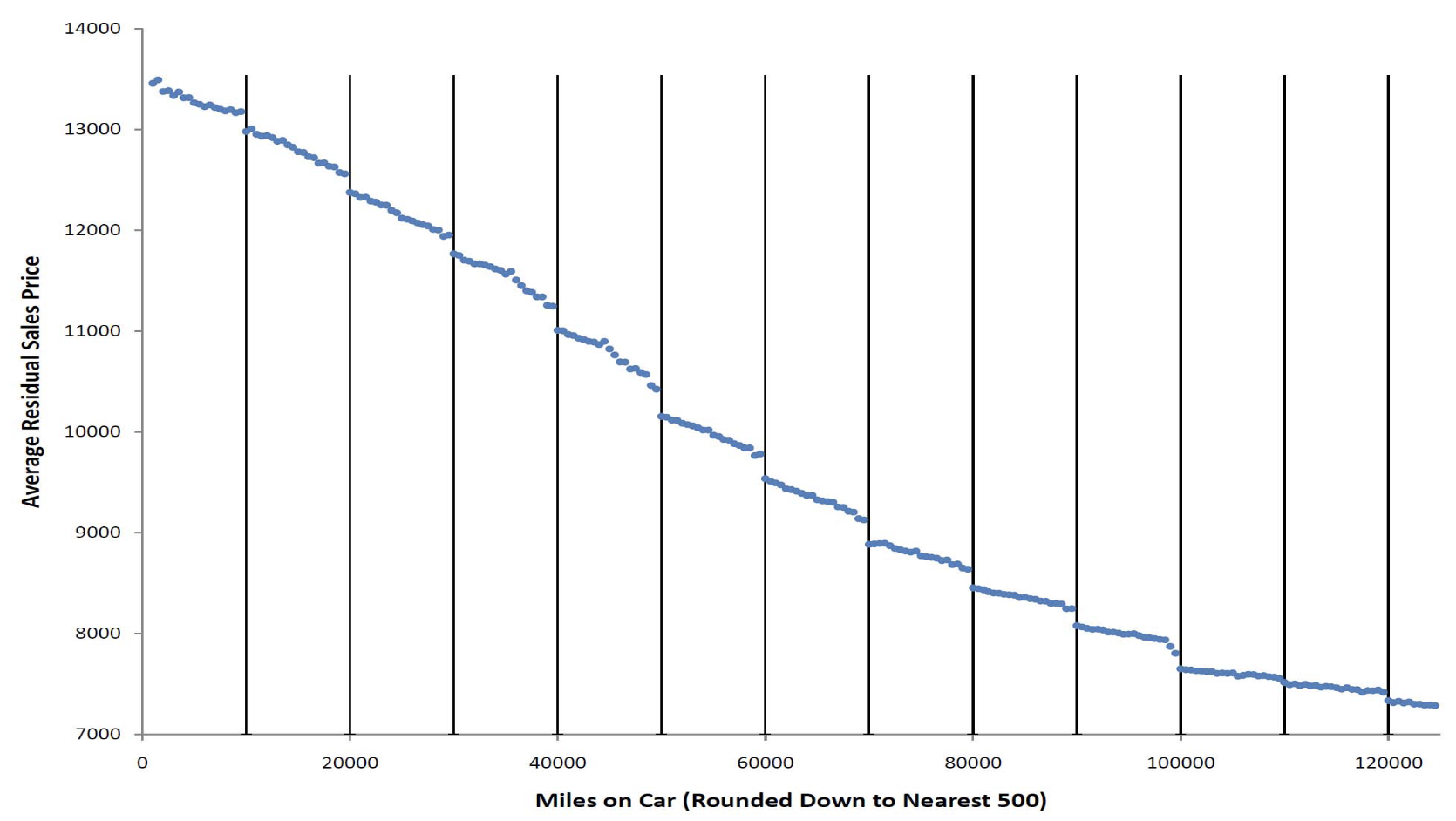
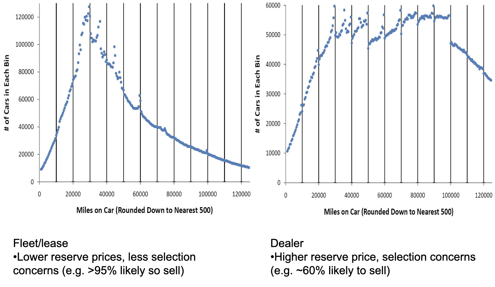
Mark Ainsworth points out that there are discontinuities at $10k boundaries in U.S. auto auction sales prices as well as volume of vehicles offered at auction. The price graph below adjusts for a number of factors such as model year, but we can see the same discontinuities in the raw unadjusted data.
Authors of psychology papers are incentivized to produce papers with p values below some threshold, usually 0.05, but sometimes 0.1 or 0.01. Masicampo et al. plotted p values from papers published in three psychology journals and found a curiously high number of papers with p values just below 0.05.
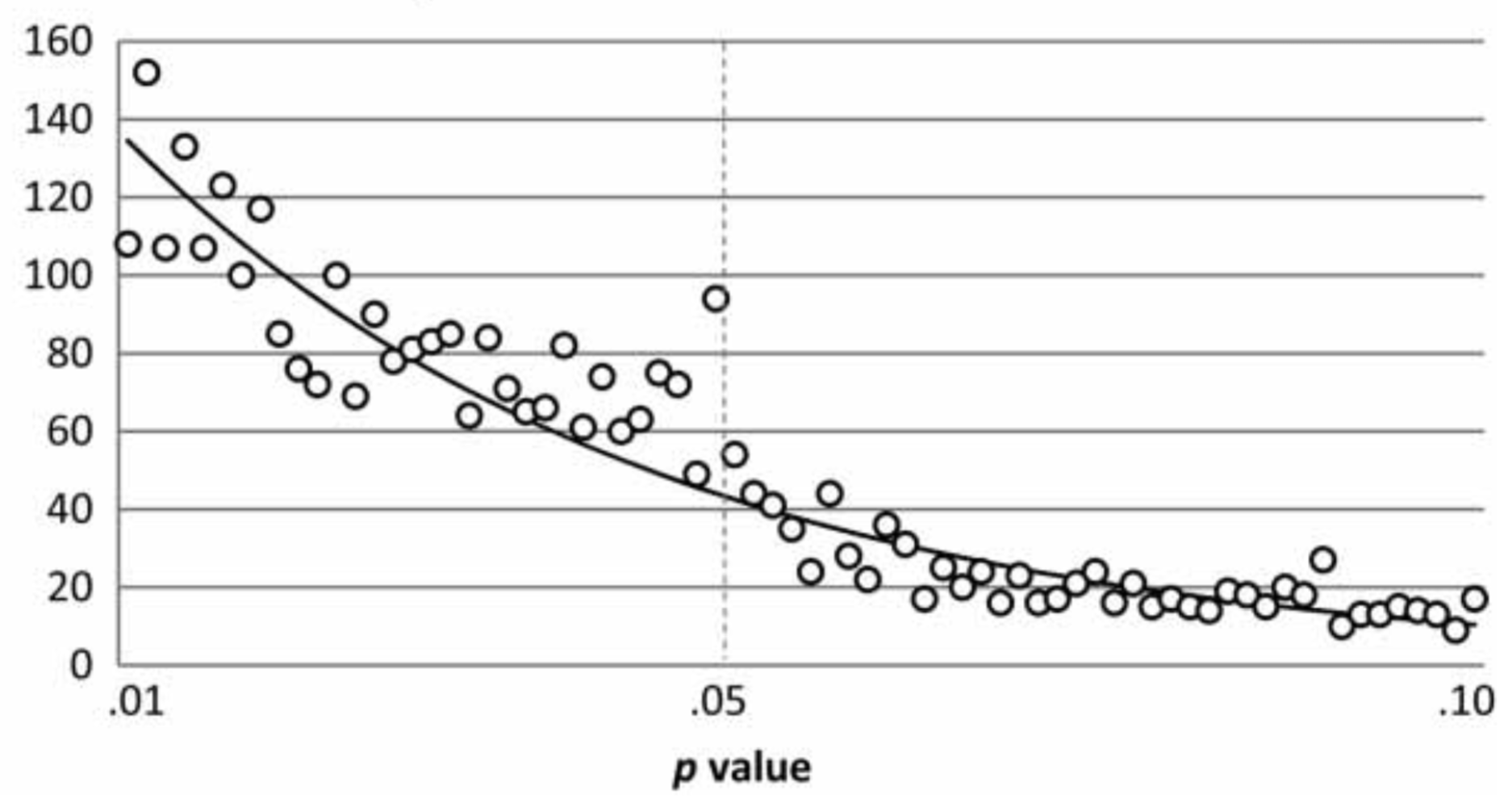
The spike at p = 0.05 consistent with a number of hypothesis that aren't great, such as:
- Authors are fudging results to get p = 0.05
- Journals are much more likely to accept a paper with p = 0.05 than if p = 0.055
- Authors are much less likely to submit results if p = 0.055 than if p = 0.05
Head et al. (2015) surveys the evidence across a number of fields.
Andrew Gelman and others have been campaigning to get rid of the idea of statistical significance and p-value thresholds for years, see this paper for a short summary of why. Not only would this reduce the incentive for authors to cheat on p values, there are other reasons to not want a bright-line rule to determine if something is "significant" or not.
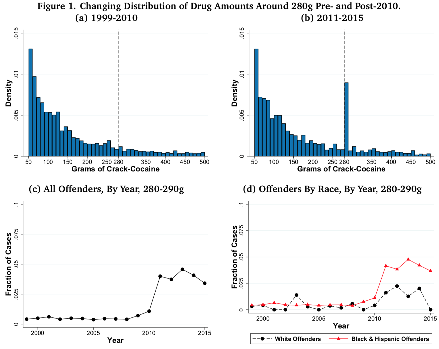
The top two graphs in this set of four show histograms of the amount of cocaine people were charged with possessing before and after the passing of the Fair Sentencing Act in 2010, which raised the amount of cocaine necessary to trigger the 10-year mandatory minimum prison sentence for possession from 50g to 280g. There's a relatively smooth distribution before 2010 and a sharp discontinuity after 2010.
The bottom-left graph shows the sharp spike in prosecutions at 280 grams followed by what might be a drop in 2013 after evidentiary standards were changed.
This is a histogram of high school exit exam scores from the Polish language exam. We can see that a curiously high number of students score 30 or just above thirty while curiously low number of students score from 23-29. This is from 2013; other years I've looked at (2010-2012) show a similar discontinuity.
Math exit exam scores don't exhibit any unusual discontinuities in the years I've examined (2010-2013).
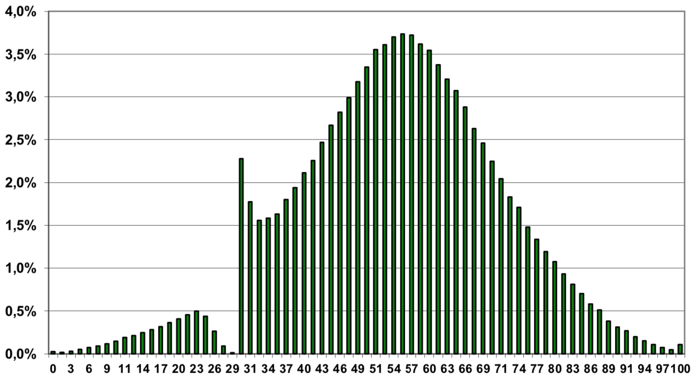
An anonymous reddit commenter explains this:
When a teacher is grading matura (final HS exam), he/she doesn't know whose test it is. The only things that are known are: the number (code) of the student and the district which matura comes from (it is usually from completely different part of Poland). The system is made to prevent any kind of manipulation, for example from time to time teachers supervisor will come to check if test are graded correctly. I don't wanna talk much about system flaws (and advantages), it is well known in every education system in the world where final tests are made, but you have to keep in mind that there is a key, which teachers follow very strictly when grading.
So, when a score of the test is below 30%, exam is failed. However, before making final statement in protocol, a commision of 3 (I don't remember exact number) is checking test again. This is the moment, where difference between humanities and math is shown: teachers often try to find a one (or a few) missing points, so the test won't be failed, because it's a tragedy to this person, his school and somewhat fuss for the grading team. Finding a "missing" point is not that hard when you are grading writing or open questions, which is a case in polish language, but nearly impossible in math. So that's the reason why distribution of scores is so different.
As with p values, having a bright-line threshold, causes curious behavior. In this case, scoring below 30 on any subject (a 30 or above is required in every subject) and failing the exam has arbitrary negative effects for people, so teachers usually try to prevent people from failing if there's an easy way to do it, but a deeper root of the problem is the idea that it's necessary to produce a certification that's the discretization of a continuous score.
Birth month and sports
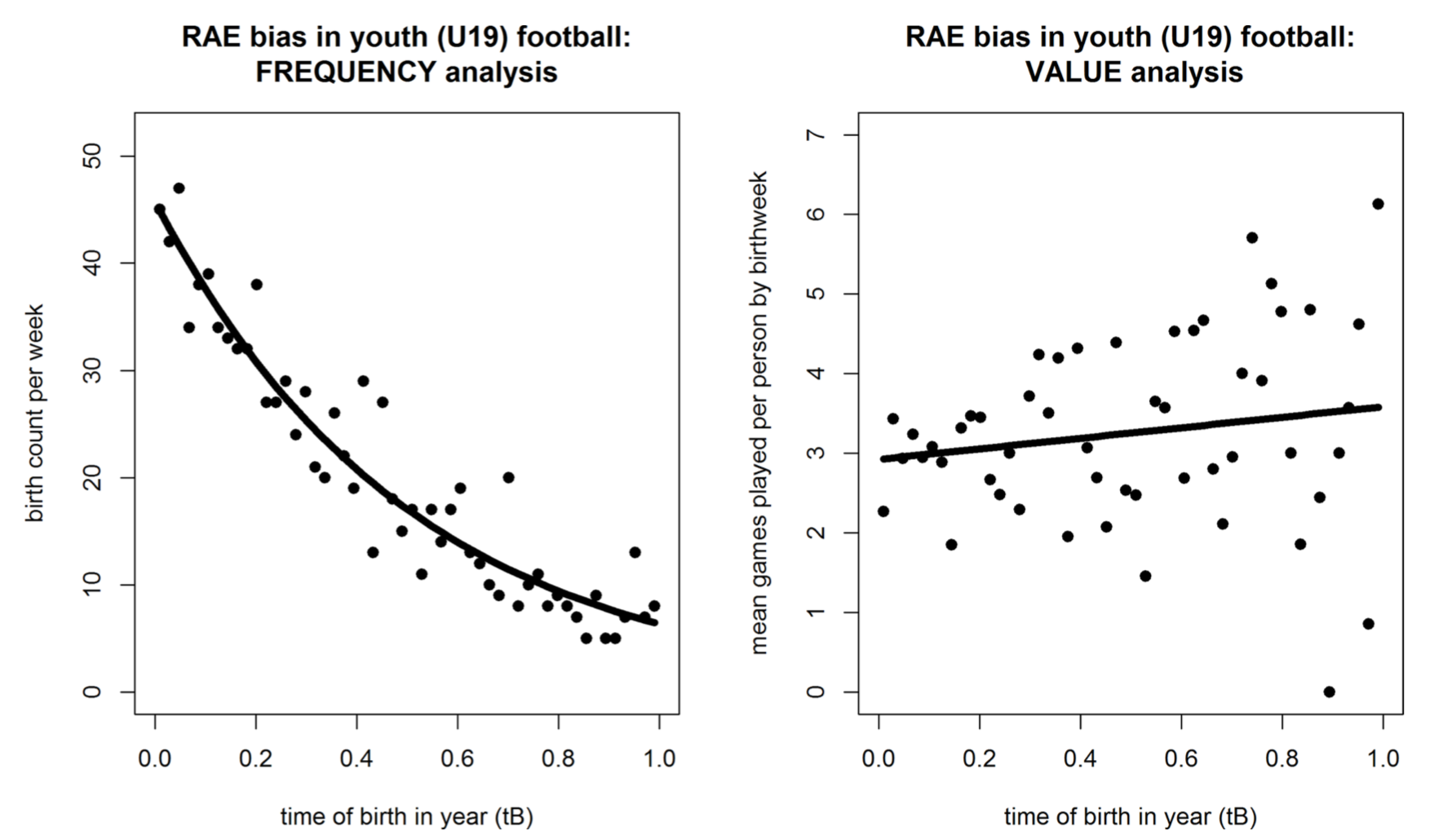
These are scatterplots of football (soccer) players in the UEFA Youth League. The x-axis on both of these plots is how old players are modulo the year, i.e., their birth month normalized from 0 to 1.
The graph on the left is a histogram, which shows that there is a very strong relationship between where a person's birth falls within the year and their odds of making a club at the UEFA Youth League (U19) level. The graph on the right purports to show that birth time is only weakly correlated with actual value provided on the field. The authors use playing time as a proxy for value, presumably because it's easy to measure. That's not a great measure, but the result they find (younger-within-the-year players have higher value, conditional on making the U19 league) is consistent with other studies on sports and discrimination, which ind (for example) that black baseball players were significantly better than white baseball players for decades after desegregation in baseball, French-Canadian defensemen are also better than average (French-Canadians are stereotypically afraid to fight, don't work hard enough, and are too focused on offense).
The discontinuity isn't directly shown in the graphs above because the graphs only show birth date for one year. If we were to plot birth date by cohort across multiple years, we'd expect to see a sawtooth pattern in the probability that a player makes it into the UEFA youth league with a 10x difference between someone born one day before vs. after the threshold.
This phenomenon, that birth day or month is a good predictor of participation in higher-level youth sports as well as pro sports, has been studied across a variety of sports.
It's generally believed that this is caused by a discontinuity in youth sports:
- Kids are bucketed into groups by age in years and compete against people in the same year
- Within a given year, older kids are stronger, faster, etc., and perform better
- This causes older-within-year kids to outcompete younger kids, which later results in older-within-year kids having higher levels of participation for a variety of reasons
This is arguably a "bug" in how youth sports works. But as we've seen in baseball as well as a survey of multiple sports, obviously bad decision making that costs individual teams tens or even hundreds of millions of dollars can persist for decades in the face of people pubicly discussing how bad the decisions are. In this case, the youth sports teams aren't feeder teams to pro teams, so they don't have a financial incentive to select players who are skilled for their age (as opposed to just taller and faster because they're slightly older) so this system-wide non-optimal even more difficult to fix than pro sports teams making locally non-optimal decisions that are completely under their control.
Kawai et al. looked at Japanese government procurement, in order to find suspicious pattern of bids like the ones described in Porter et al. (1993), which looked at collusion in procurement auctions on Long Island (in New York in the United States). One example that's given is:
In February 1983, the New York State Department of Transportation (DoT) held a pro- curement auction for resurfacing 0.8 miles of road. The lowest bid in the auction was $4 million, and the DoT decided not to award the contract because the bid was deemed too high relative to its own cost estimates. The project was put up for a reauction in May 1983 in which all the bidders from the initial auction participated. The lowest bid in the reauction was 20% higher than in the initial auction, submitted by the previous low bidder. Again, the contract was not awarded. The DoT held a third auction in February 1984, with the same set of bidders as in the initial auction. The lowest bid in the third auction was 10% higher than the second time, again submitted by the same bidder. The DoT apparently thought this was suspicious: “It is notable that the same firm submitted the low bid in each of the auctions. Because of the unusual bidding patterns, the contract was not awarded through 1987.”
It could be argued that this is expected because different firms have different cost structures, so the lowest bidder in an auction for one particular project should be expected to be the lowest bidder in subsequent auctions for the same project. In order to distinguish between collusion and real structural cost differences between firms, Kawai et al. (2015) looked at auctions where the difference in bid between the first and second place firms was very small, making the winner effectively random.
In the auction structure studied, bidders submit a secret bid. If the secret bid is above a secret minimum, then the lowest bidder wins the auction and gets the contract. If not, the lowest bid is revealed to all bidders and another round of bidding is done. Kawai et al. found that, in about 97% of auctions, the bidder who submitted the lowest bid in the first round also submitted the lowest bid in the second round (the probability that the second lowest bidder remains second lowest was 26%).
Below, is a histogram of the difference in first and second round bids between the first-lowest and second-lowest bidders (left column) and the second-lowest and third-lowest bidders (right column). Each row has a different filtering criteria for how close the auction has to be in order to be included. In the top row, all auctions that reached the third round were included; in second, and third rows, the normalized delta between the first and second biders was less than 0.05 and 0.01, respectively; in the last row, the normalized delta between the first and the third bidder was less than 0.03. All numbers are normalized because the absolute size of auctions can vary.
We can see that the distributions of deltas between the first and second round are roughly symmetrical when comparing second and third lowest bidders. But when comparing first and second lowest bidders, there's a sharp discontinuity at zero, indicating that second-lowest bidder almost never lowers their bid by more than the first-lower bidder did. If you read the paper, you can see that the same structure persists into auctions that go into a third round.
I don't mean to pick on Japanese procurement auctions in particular. There's an extensive literature on procurement auctions that's found collusion in many cases, often much more blatant than the case presented above (e.g., there are a few firms and they round-robin who wins across auctions, or there are a handful of firms and every firm except for the winner puts in the same losing bid).
The histograms below show a sharp discontinuity between 13 and 14, which is the difference between an A grade and a B grade. It appears that some regions also have a discontinuity between 27 and 28, which is the difference between a B and a C and this older analysis from 2014 found what appears to be a similar discontinuity between B and C grades.
Inspectors have discretion in what violations are tallied and it appears that there are cases where restaurant are nudged up to the next higher grade.
A histogram of marathon finishing times (finish times on the x-axis, count on the y-axis) across 9,789,093 finishes shows noticeable discontinuities at every half hour, as well as at "round" times like :10, :15, and :20.
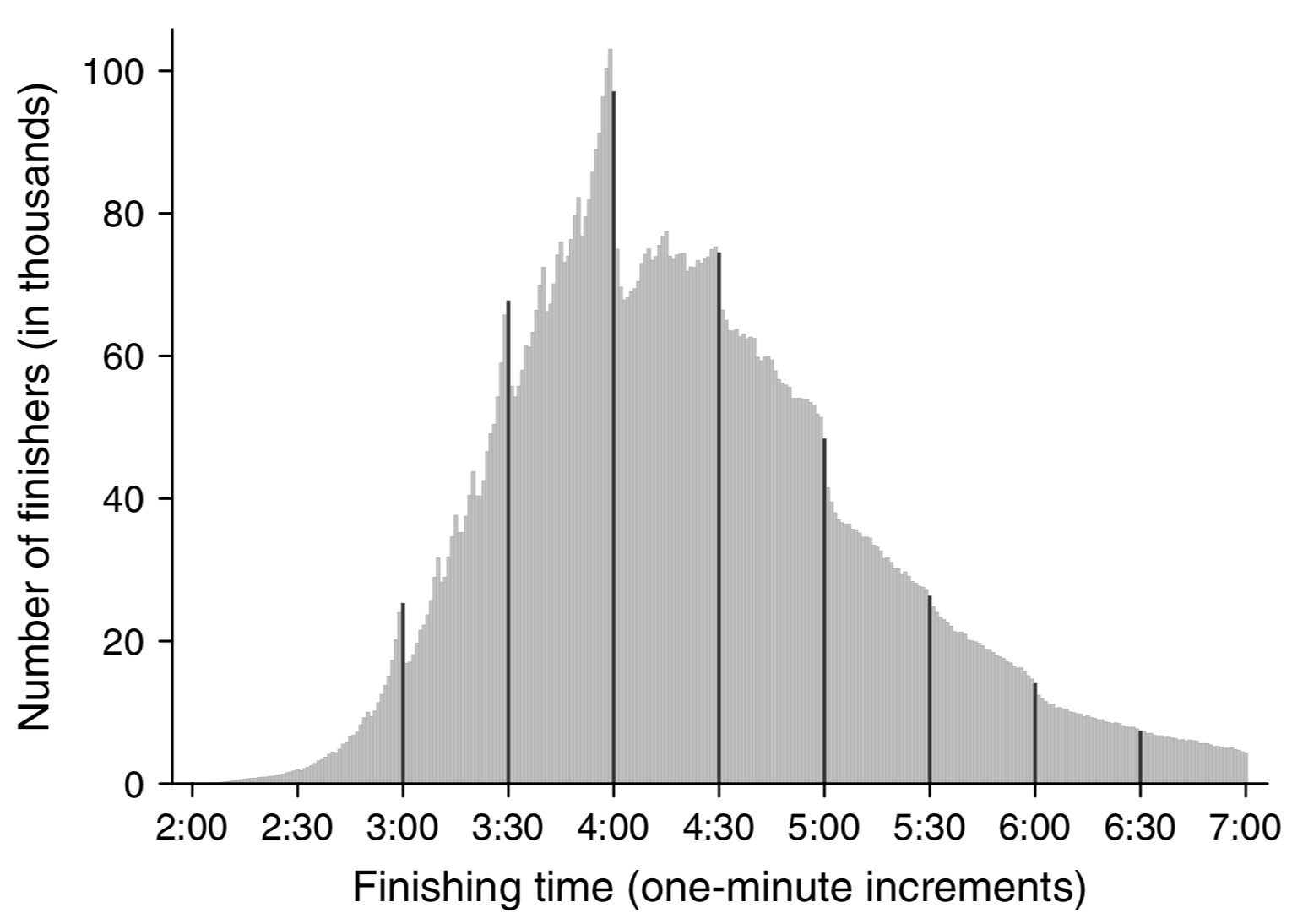
An analysis of times within each race (see section 4.4, figures 7-9) indicates that this is at least partially because people speed up (or slow down less than usual) towards the end of races if they're close to a "round" time.
Notes
This post doesn't really have a goal or a point, it's just a collection of discontinuities that I find fun.
One thing that's maybe worth noting is that I've gotten a lot of mileage out in my career both out of being suspicious of discontinuities and figuring out where they come from and also out of applying standard techniques to smooth out discontinuities.
For finding discontinuities, basic tools like "drawing a scatterplot", "drawing a histogram", "drawing the CDF" often come in handy. Other kinds of visualizations that add temporality, like flamescope, can also come in handy.
We noted above that queues create a kind of discontinuity that, in some circumstances, should be smoothed out. We also noted that we see similar behavior for other kinds of thresholds and that randomization can be a useful tool to smooth out discontinuities in thresholds as well. Randomization can also be used to allow for reducing quantization error when reducing precision with ML and in other applications.
Thanks to Leah Hanson, Omar Rizwan, Dmitry Belenko, Kamal Marhubi, Danny Vilea, Nick Roberts, Lifan Zeng, Mark Ainsworth, Wesley Aptekar-Cassels, Thomas Hauk, @BaudDev, and Michael Sullivan for comments/corrections/discussion.
Also, please feel free to send me other interesting discontinuities!