It's common knowledge that Android device tend to be more out of date than iOS devices, but what does this actually mean? Let’s look at android marketshare data to see how old devices in the wild are. The x axis of the plot below is date, and the y axis is Android marketshare. The share of all devices sums to 100% (with some artifacts because the public data Google provides is low precision).
Color indicates age:
- blue: current (API major version)
- yellow: 6 months
- orange: 1 year
- dark red: 2 years
- bright red/white: 3 years
- light grey: 4 years
- grey: 5 years
- black: 6 years or more
If we look at the graph, we see a number of reverse-S shaped contours; between each pair of contours, devices get older as we go from left to right. Each contour corresponds to the release of a new android version and the associated devices running that android version. As time passes, devices on that version get older. When a device is upgraded, they’re effectively removed from one contour into a new contour and the color changes to a less outdated color.

There are three major ways in which this graph understates the number of outdated devices:
First, we’re using API version data for this and don’t have access to the marketshare of point releases and minor updates, so we assume that all devices on the same API version are up to date until the moment a new API version is released, but many (and perhaps most) devices won’t receive updates within an API version.
Second, this graph shows marketshare, but the number of Android devices has dramatically increased over time. For example, if we look at the 80%-ile most outdated devices (i.e., draw a line 20% up from the bottom), it the 80%-ile device today is a few months more outdated than it was in 2014. The huge growth of Android means that there are many many more outdated devices now than there were in 2014.
Third, this data comes from scraping Google Play Store marketshare info. That data shows marketshare of devices that have visited in the Play Store in the last 7 days. In general, it seems reasonable to believe that devices that visit the play store are more up to date than devices that don’t, so we should expect an unknown amount of bias in this data that causes the graph to show that devices are newer than they actually are. This seems plausible both for devices that are used as conventional mobile devices as well as for mobile devices that have replaced things liked traditonally embedded devices, PoS boxes, etc.
If we're looking at this from a security standpoint, some devices will receive updates without updating their major version, skewing the date to look more outdated than it used it. However, when researchers have used more fine-grained data to see which devices are taking updates, they found that this was not a large effect.
One thing we can see from that graph is that, as time goes on, the world accumulates a larger fraction of old devices over time. This makes sense and we could have figured this out without looking at the data. After all, back at the beginning of 2010, Android phones couldn’t be much more than a year old, and now it’s possible to have Android devices that are nearly a decade old.
Something that wouldn’t have been obvious without looking at the data is that the uptake of new versions seems to be slowing down -- we can see this by looking at the last few contour lines at the top right of the graph, corresponding to the most recent Android releases. These lines have a shallower slope than the contour lines for previous releases. Unfortunately, with this data alone, we can’t tell why the slope is shallower. Some possible reasons might be:
- Android growth is slowing down
- Android device turnover (device upgrade rate) is slowing down
- Fewer devices are receiving updates
Without more data, it’s impossible to tell how much each of these is contributing to the problem. BTW, let me know if you know of a reasonable source for the active number of Android devices going back to 2010! I’d love to produce a companion graph of the total number of outdated devices.
But even with the data we have, we can take a guess at how many outdated devices are in use. In May 2017, Google announced that there are over two billion active Android devices. If we look at the latest stats (the far right edge), we can see that nearly half of these devices are two years out of date. At this point, we should expect that there are more than one billion devices that are two years out of date! Given Android's update model, we should expect approximately 0% of those devices to ever get updated to a modern version of Android.
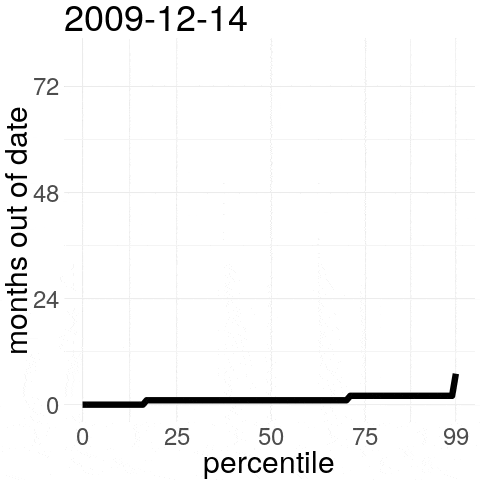
Percentiles
Since there’s a lot going on in the graph, we might be able to see something if we look at some subparts of the graph. If we look at a single horizontal line across the graph, that corresponds to the device age at a certain percentile:

In this graph, the date is on the x axis and the age in months is on the y axis. Each line corresponds to a different percentile (higher percentile is older), which corresponds to a horizontal slice of the top graph at that percentile.
Each individual line seems to have two large phases (with some other stuff, too). There’s one phase where devices for that percentile get older as quickly as time is passing, followed by a phase where, on average, devices only get slightly older. In the second phase, devices sometimes get younger as new releases push younger versions into a certain percentile, but this doesn’t happen often enough to counteract the general aging of devices. Taken as a whole, this graph indicates that, if current trends continue, we should expect to see proportionally more old Android devices as time goes on, which is exactly what we’d expect from the first, busier, graph.
Dates
Another way to look at the graph is to look at a vertical slice instead of a horizontal slice. In that case, each slice corresponds to looking at the ages of devices at one particular date:

In this plot, the x axis indicates the age percentile and the y axis indicates the raw age in months. Each line is one particular date, with older dates being lighter / yellower and newer dates being darker / greener.
As with the other views of the same data, we can see that Android devices appear to be getting more out of date as time goes on. This graph would be too busy to read if we plotted data for all of the dates that are available, but we can see it as an animation:
iOS
For reference, iOS 11 was released two months ago and it now has just under 50% iOS marketshare despite November’s numbers coming before the release of the iPhone X (this is compared to < 1% marketshare for the latest Android version, which was released in August). It’s overwhelmingly likely that, by the start of next year, iOS 11 will have more than 50% marketshare and there’s an outside chance that it will have 75% marketshare, i.e., it’s likely that the corresponding plot for iOS would have the 50%-ile (red) line in the second plot at age = 0 and it’s not implausible that the 75%-ile (orange) line would sometimes dip down to 0. As is the case with Android, there are some older devices that stubbornly refuse to update; iOS 9.3, released a bit over two years ago, sits at just a bit above 5% marketshare. This means that, in the iOS version of the plot, it’s plausible that we’d see the corresponding 99%-ile (green) line in the second plot at a bit over two years (half of what we see for the Android plot).
Windows XP
People sometimes compare Android to Windows XP because there are a large number of both in the wild and in both cases, most devices will not get security updates. However, this is tremendously unfair to Windows XP, which was released on 10/2001 and got security updates until 4/2014, twelve and a half years later. Additionally, Microsoft has released at least one security update after the official support period (there was an update in 5/2017 in response to the WannaCry ransomware). It's unfortunate that Microsoft decided to end support for XP while there are still so many XP boxes in the wild, but supporting an old OS for over twelve years and then issuing an emergency security patch after more fifteen years puts Microsoft into a completely different league than Google and Apple when it comes to device support.
Another difference between Android and Windows is that Android's scale is unprecedented in the desktop world. The were roughly 200 million PCs sold in 2017. Samsung alone has been selling that many mobile devices per year since 2008. Of course, those weren't Android devices in 2008, but Android's dominance in the non-iOS mobile space means that, overall, those have mostly been Android devices. Today, we still see nearly 50 year old PDP-11 devices in use. There are few enough PDPs around that running into one is a cute, quaint, surprise (0.6 million PDP-11s were sold). Desktops boxes age out of service more quickly than PDPs and mobile devices age out of service even more quickly, but the sheer difference in number of devices caused by the ubiquity of modern computing devices means that we're going to see many more XP-era PCs in use 50 years after the release of XP and it's plausible we'll see even more mobile devices around 50 years from now. Many of these ancient PDP, VAX, DOS, etc. boxes are basically safe because they're run in non-networked configurations, but it looks like the same thing is not going to be true for many of these old XP and Android boxes that are going to stay in service for decades.
Conclusion
We’ve seen that Android devices appear to be getting more out of date over time. This makes it difficult for developers to target “new” Android API features, where new means anything introduced in the past few years. It also means that there are a lot of Android devices out there that are behind in terms of security. This is true both in absolute terms and also relative to iOS.
Until recently, Android was directly tied to the hardware it ran on, making it very painful to keep old devices up to date because that requiring a custom Android build with phone-specific (or at least SoC-specific work). Google claims that this problem is fixed in the latest Android version (8.0, Oreo). People who remember Google's "Android update alliance" annoucement in 2011 may be a bit skeptical of the more recent annoucement. In 2011, Google and U.S. carries announced that they'd keep devices up to date for 18 months, which mostly didn't happen. However, even if the current annoucement isn't smoke and mirrors and the latest version of Android solves the update probem, we've seen that it takes years for Android releases to get adopted and we've also seen that the last few Android releases have significantly slower uptake than previous releases. Additionally, even though this is supposed to make updates easier, it looks like Android is still likely to stay behind iOS in terms of updates for a while. Google has promised that its latest phone (Pixel 2, 10/2017) will get updates for three years. That seems like a step in the right direction, but as we’ve seen from the graphs above, extending support by a year isn’t nearly enough to keep most Android devices up to date. But if you have an iPhone, the latest version of iOS (released 9/2017) works on devices back to the iPhone 5S (released 9/2013).
If we look at the newest Android release (8.0, 8/2017), it looks like you’re quite lucky if you have a two year old device that will get the latest update. The oldest “Google” phone supported is the Nexus 6P (9/2015), giving it just under two years of support.
If you look back at devices that were released around when the iPhone5S, the situation looks even worse. Back then, I got a free Moto X for working at Google; the Moto X was about as close to an official Google phone as you could get at the time (this was back when Google owned Moto). The Moto X was released on 8/2013 (a month before the iPhone 5S) and the latest version of Android it supports is 5.1, which was released on 2/2015, a little more than a year and a half later. For an Android phone of its era, the Moto X was supported for an unusually long time. It's a good sign that things look worse as look further back in time, but at the rate things are improving, it will be years before there's a decently supported Android device released and then years beyond those years before that Android version is in widespread use. It's possible that Fuchsia will fix this, but Fuchsia is also many years away from widespread use.
In a future post, we'll look at Android response latency, which is much higher than iPhone and iPad latency.
Thanks to Leah Hanson, Kate Murphy, Daniel Thomas, Marek Majkowski, @zofrex, @Aissn, Chris Palmer, JonLuca De Caro, and an anonymous person for comments/corrections/related discussion.
Also, thanks to Victorien Villard for making the data these graphs were based on available!